We all remember when “mobile-first” became the golden rule of web design. It made perfect sense: mobile traffic had overtaken desktop, and suddenly every brand needed a site that looked sharp on a smartphone.
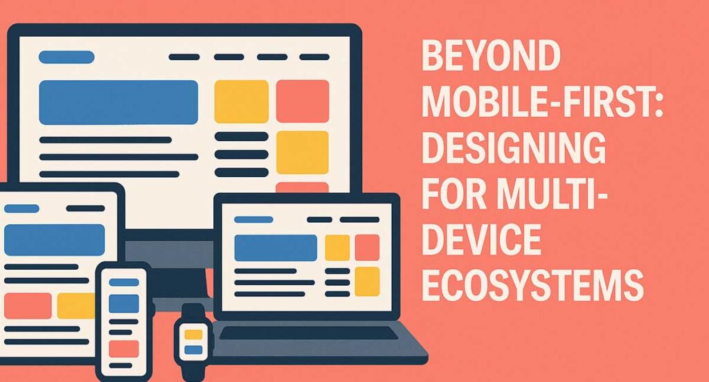
But here’s the reality in 2025: your users aren’t just bouncing between mobile and desktop anymore. They’re checking tablets on the sofa, swiping smartwatches on the train, browsing on laptops at work, and even streaming sites on smart TVs. Sometimes they do all of this in a single day.
If your website isn’t built to handle this, it feels clunky, inconsistent, and out of step with real life. That’s why we’re moving from mobile-first to ecosystem-first design: creating digital experiences that move seamlessly with your users, no matter the device in their hand, pocket, or living room.
Why Multi-Device Design Matters
Think about the average customer journey. Someone spots your service on social media while scrolling on their phone during a commute. Later, they dig deeper on a desktop at work, before finally completing the purchase on a tablet at home.
If their cart doesn’t carry over, if navigation feels different, or if branding looks inconsistent, the experience feels broken. That’s a customer lost.
According to the Interaction Design Foundation, designing across devices is no longer optional — it’s essential. Businesses that can’t deliver a frictionless multi-device journey risk being left behind by competitors who can.
Principles for Designing Across Devices
Moving beyond mobile-first isn’t about chasing perfect screen sizes; it’s about creating experiences that feel natural everywhere.
- Consistency – Imagine your website as a shop. Whether someone walks in through the side door (mobile), the front door (desktop), or the back door (tablet), it should feel unmistakably yours.
- Continuity – Users expect to be able to pick up where they left off. Start browsing on mobile, finish on desktop — the transition should feel effortless.
- Context-awareness – Scrolling a TV screen with a remote is nothing like thumbing a phone. Each device has its rhythm, and your design needs to respect that.
- Performance – Nobody waits for slow-loading pages. Whether it’s fibre broadband at home or patchy 4G in a café, speed is non-negotiable.
- Accessibility – Multi-device design means considering all users, including those with screen readers, high-contrast modes, and voice navigation. Accessibility isn’t an afterthought; it’s a foundation.
Ready for a Website That Works as Hard as You Do?
Your website is often the first impression customers have of your business. At Digital Hype, we design and build responsive, conversion-focused websites for businesses across Bournemouth, Poole, Dorset and UK-wide. Let’s create a site that not only looks great but also drives real results.
Contact Our Web Design TeamCommon Challenges in Multi-Device Design
Of course, designing across so many platforms comes with hurdles:
- Fragmentation – There are hundreds of screen sizes and resolutions. Designing for all of them feels like wrestling with shifting sand.
- Different inputs – a finger tap, a mouse click, a TV remote, or a “Hey Siri” voice command – each require different design thinking.
- Data syncing – If someone adds an item to their cart on mobile, they expect it to still be there on desktop. Fail here, and you lose credibility.
- Testing overhead – Emulators are handy, but nothing beats holding a tablet, clicking a smart TV remote, or testing in an actual car dashboard to see how it works in the real world.
Helpful Table: Device Contexts and Design Priorities
| Device Type | Typical Use Context | Key Design Priorities | Common Pitfalls to Avoid |
| Smartphone | On-the-go, quick sessions | Speed, touch-friendly UI, minimal forms | Heavy graphics that slow load times |
| Tablet | Casual browsing, media | Larger touch targets, flexible layouts | Ignoring portrait/landscape shifts |
| Desktop/Laptop | Work, in-depth browsing | Multi-column layouts, advanced navigation | Overcomplicating journeys |
| Smart TV | Lean-back entertainment | Big visuals, remote-friendly menus | Tiny text or cluttered menus |
| Wearables | Quick glance interactions | Glanceable info, voice-first design | Trying to cram full experiences |
| Car dashboards | Navigation, hands-free use | Voice-first, distraction-free UI | Overloading visuals or multi-step flows |
Best Practice for Multi-Device Design
- Keep every element intentional.
- Test across real devices, not just emulators.
- Use heatmaps and analytics to understand behaviour across platforms.
- Align your design hierarchy with SEO structures to support usability and rankings.
Frequently Asked Questions
Q1. Is mobile-first design still relevant in 2025?
Yes — but it’s only part of the picture. Businesses now need to focus on ecosystem-first design, ensuring continuity across all devices and platforms to maintain seamless user experiences.
Q2. How can I make sure users have continuity across devices?
Rely on cloud syncing for carts, logins, and preferences. That way, customers never feel like they’re starting over.
Q3. What’s the difference between responsive and adaptive design?
Responsive design flexes fluidly to any screen size, while adaptive uses set breakpoints. For multi-device ecosystems, many brands mix both.
Q4. How do I design for smart TVs or wearables?
TVs need big visuals and remote-friendly menus. Wearables should focus on snappy, glanceable info and often lean on voice controls.
Q5. Will designing for multiple devices be more expensive?
At first, yes — but the ROI is clear. Businesses that design for ecosystems see higher engagement and loyalty.
Q6. Does multi-device design affect SEO?
Absolutely. Consistent, fast-loading experiences across devices enhance Core Web Vitals, reduce bounce rates, and improve search engine rankings.
Q7. Can small businesses afford to design for all devices?
Start with mobile and desktop. Then expand to the platforms your customers use most. You don’t need to cover everything from day one.
Q8. Where’s the best place to start if I want to go beyond mobile-first?
Begin with a scalable design system. Identify your customers’ most common devices and ensure the journey flows between them seamlessly.
Designing for Ecosystems, Not Devices
Your customers don’t think in devices. They don’t say, “I’ll engage with this brand on my mobile journey today.” They just expect you to be there, consistent, clear, and easy, whether they’re on a phone at lunch, a laptop at work, or a TV at night.
That’s the essence of ecosystem-first design: experiences that feel right wherever people find you.
At Digital Hype, we help businesses in Bournemouth, Poole, Dorset, and across the UK deliver precisely that. Our mobile-first web design services build consistency, our SEO expertise ensures performance, and our online marketing ties it all back to growth.
Because your website isn’t just a set of pages, it’s an ecosystem. And when that ecosystem works everywhere, your customers will too.


