The Silent Frustration Behind Most Business Websites
I’ve lost count of how many business owners have said this to me over coffee:
“Our site looks great — but it’s not doing anything.”
They’re not wrong. Their websites do look good, glossy visuals, polished branding, animated sliders, all the trimmings. But when you open the analytics dashboard, there’s silence. Hardly any leads. A few scattered clicks. The odd contact form.
That disconnect is everywhere.
The problem isn’t that the site was poorly designed; it’s that it was designed for admiration, not action.
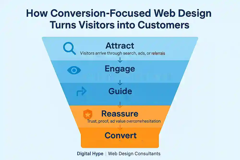
That’s where Conversion-Focused Web Design (CFWD) earns its place.
What Conversion-Focused Web Design Actually Means
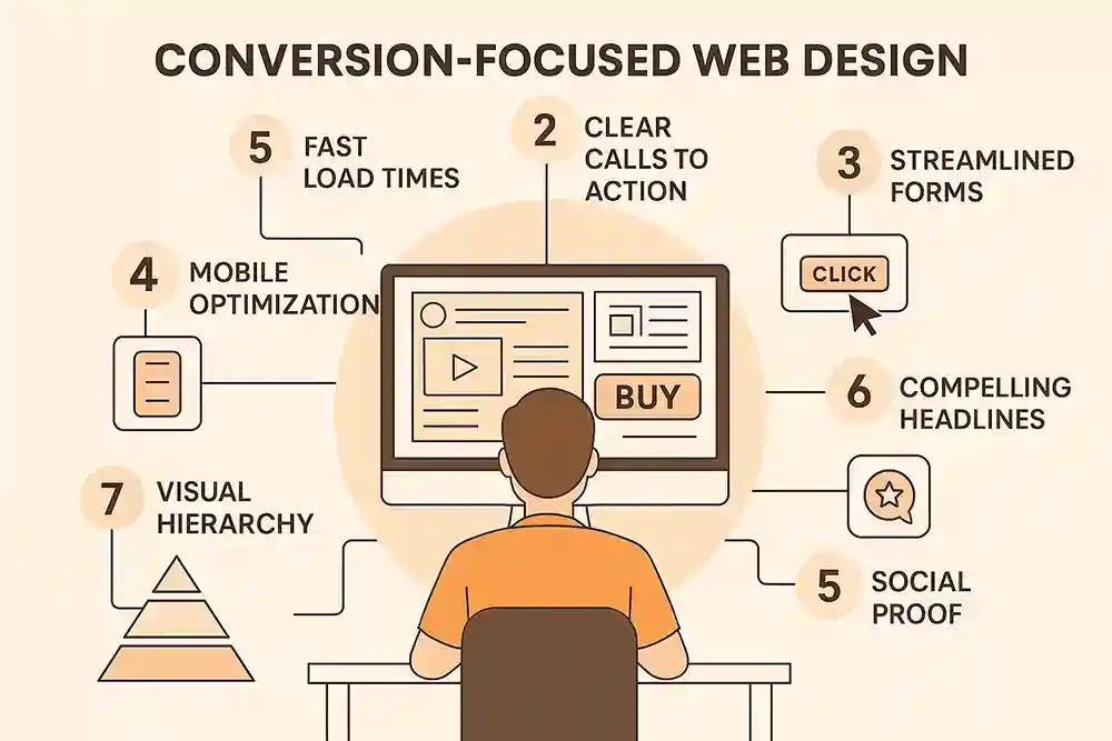
At its core, Conversion-Focused Web Design is about building a website that persuades visitors to take action, such as enquiring, booking, buying, or subscribing. Every page, image, headline, and button has a purpose.
It’s designed with commercial intent baked into every layer. Not decoration, but direction.
While traditional web design centres around branding and aesthetics, CFWD bridges design with psychology, content strategy, and behavioural data. It’s about helping visitors make decisions more quickly and with greater confidence.
A conversion-focused site isn’t just pretty. It’s persuasive, measurable, and ruthlessly user-centric.
Why This Matters More Than Ever
We now live in the era of short attention spans and endless choice. People decide whether to stay on your website within five seconds, often in less time.
Those seconds aren’t about your colour palette or your logo. They’re about trust. Can this company help me? Do they look credible? Is this worth my time?
A website that answers those questions instantly earns the right to sell.
When you design for conversion, you stop chasing vanity metrics and start tracking what really matters:
- Enquiries instead of impressions
- Sales instead of sessions
- Retention instead of reach
That’s what separates a business that survives from one that scales.
What Most Websites Get Wrong
I worked with a Dorset retailer last year who had spent months perfecting their homepage animations. It looked like a digital fireworks show. But conversions? Barely a flicker.
Here’s what we found:
- The primary CTA (“Learn More”) led to a dead-end page.
- Their contact form had eight fields, half of which were unnecessary.
- Their testimonials sat below three full scrolls of filler text.
Once we stripped away the fluff and gave users a single explicit action, enquiries tripled within six weeks.
That’s the unspoken truth about most websites: it’s not that users don’t want what you offer. It’s that they can’t find the next step.
The Real Difference Between Regular Design and CFWD
| Aspect | Traditional Web Design | Conversion-Focused Web Design |
| Purpose | To look professional and on-brand | To generate measurable business results |
| Focus | Aesthetic presentation | Human behaviour and user psychology |
| Process | One-off project | Continuous learning and optimisation |
| Content | Written after the design | Drives and shapes the design |
| Testing | Optional | Essential |
| Outcome | A website that looks complete | A website that performs consistently |
It’s not a competition between “creative” and “commercial.” It’s a shift from what it looks like to what it achieves.
The Dorset Café That Proved It Works
One of my favourite examples comes from a small café we worked with. Their owner came to Digital Hype frustrated, “We’ve updated our website twice, and bookings still come through Facebook messages.”
Instead of another rebuild, we restructured what they already had:
- A single, bright “Book a Table” button above the fold.
- Real photos of the café and customers instead of stock images.
- Local reviews right beside the booking form.
In less than two months, their online bookings doubled. Same café. Same people. Different focus.
That’s the power of CFWD, it turns good design into business growth.
Getting Started with Conversion-Focused Web Design
Most people start by redesigning the visually appealing aspects. New banner, new colours, new fonts. I understand this, that’s the visible stuff. However, the truth is that the groundwork begins long before a designer opens Figma.
Here’s how I tell clients to begin, even if you’ve got zero design experience:
- Pick one goal per page.
If your homepage is trying to sell, educate, and entertain at the same time, it’ll do none of them well. Pick one goal. You can continually expand later. - Think about your customer’s questions.
If you were on your own site for the first time, what would you want to know within five seconds? That’s what belongs at the top. - Write one promise line.
Not a slogan, a promise. Something like “Helping Dorset businesses grow online through strategic design.” It grounds your message. - Gather your proof early.
A couple of short testimonials or even a screenshot of positive Google reviews works wonders. Authenticity beats polish every time. - Decide your next step.
What happens after someone clicks? If you don’t know, they won’t either. “Book a Call” or “Get a Quote”, keep it clear and visible.
You can do all of this in a notebook over a coffee. You’ll be miles ahead of most websites before a single pixel moves.
The Blueprint for Building a Website That Converts
1. Know What Success Looks Like
Every business has its version of a “conversion.” A sale, a quote request, a call. Pick one. Then make every page serve that goal, nothing else.
2. Follow the Visitor’s Path
Imagine the steps your ideal customer takes from arrival to action. If they hesitate, backtrack, or get lost, fix that. An excellent user journey should feel obvious, not clever.
(If you want that journey to shine on mobile, explore our mobile-optimised websites, because speed and simplicity convert better than any visual trick.)
3. Speak to Problems, Not Features
Your headline isn’t about you. It’s about them. “We build websites” doesn’t sell, “We help you get more leads online” does.
4. Simplify Every Form
Fewer fields = more conversions. Ask only what you truly need. Then explain what happens after they click ‘Send’.
5. Design for Trust
Use real faces, transparent pricing, and visible proof. Local trust carries weight.
6. Balance Design and Psychology
If you’re running campaigns, a purpose-built landing page design will consistently outperform your homepage. It removes noise and channels attention exactly where it needs to go.
7. Measure Relentlessly
Use Google Analytics and heatmaps. See where users stop scrolling, which buttons they ignore, and where they hesitate. Then act on it.
Already Have a Website? Here’s How to Make It Work Harder
I understand you’ve already spent money on your site. Maybe it’s only a year old. The thought of starting again feels exhausting.
Good news: you probably don’t need to. Most of the time, performance jumps come from tuning, not rebuilding.
Here’s a checklist I use when auditing client sites. Grab your homepage and work through it:
| Area | What to Check | Why It Matters |
| Headline | Does it tell me what you do in one line? | Clarity builds trust faster than design ever will. |
| CTA | Is there one clear button that says what happens next? | Too many choices = hesitation. |
| Forms | Fewer than five fields? Optional phone number? | Friction kills momentum. |
| Proof | Is there any human evidence near your CTAs? | Reviews turn “maybe” into “yes”. |
| Navigation | 5 or fewer top links? | Choice overload confuses, not impresses. |
| Mobile | Loads fast, scrolls cleanly? | If it’s clunky on your phone, it’s worse for users. |
| Tracking | Can you measure results? | No data = no direction. |
If you tick most of these boxes, you’re already in the top 20% of business sites I see.
And if something feels off, your form is too long, or your design feels crowded, our UI/UX design process can identify the invisible blockers that stop people from converting.
The Side of CFWD No One Tells You
Let’s be honest, conversion design walks a fine line. Push too hard and you look manipulative; go too soft and users drift away.
The worst offenders use countdown timers, fake scarcity, and pop-ups that guilt users into acting. It works, briefly. But it destroys trust and retention.
Good CFWD persuades without pressure. It feels natural because it’s honest: you guide the user, rather than cornering them.
There’s another balancing act too: creativity versus control. A designer might want an avant-garde layout, but if visitors can’t find your pricing or CTA, the design has failed its duty. Smart creativity serves clarity.
For brands needing that equilibrium of beauty and usability, our UI/UX design service helps bridge the gap between art and performance.
Insider Lessons from Years in the Field
After twenty years in this business, I’ve learned that conversion design isn’t about pixels, it’s about decisions. Here’s what separates amateurs from pros:
- Watch what users do, not what they say. Everyone claims to “read everything”, analytics say otherwise.
- Add trust early, not late. Testimonials at the footer are wasted. Bring them up near the first CTA.
- Test words, not colours first. A well-phrased headline beats any shade of orange.
- Don’t remove all friction. Sometimes, a minor qualifier (“Tell us about your goals”) filters serious leads from casual browsers.
- Never skip local context. Including your Dorset address, associations, and Google reviews can significantly boost conversions.
If your site sells products, everything above applies, but the stakes are higher. Great eCommerce website design merges storytelling with checkout clarity. Every click between “Add to Cart” and “Pay Now” either builds confidence or loses it.
Your First 30 Days Plan
I’ve found that the best way to build a conversion-focused site is in sprints, short bursts that stack up into something powerful.
If I were starting fresh, this is precisely how I’d spend the first month:
Week 1 – Define and Simplify
Forget about colours and fonts for now. Write down your main goal, and ruthlessly cut anything that doesn’t serve it. If you can’t explain what your site does in ten seconds, your visitors won’t either.
Week 2 – Add Proof and Purpose
Get your trust signals in order: reviews, testimonials, logos, guarantees. Move them closer to your CTAs. Here, you can also try building a focused landing page just for one product or service; you’ll be surprised at how much more it converts.
Week 3 – Test the Experience
Grab your phone, open your site, and pretend you’re a new visitor. Can you find the primary CTA without using pinch or zoom? If not, you’ll find plenty of practical ideas in our mobile-optimised websites and UI/UX design guides.
Week 4 – Measure and Refine
Install analytics and start tracking where users drop off. A straightforward metric, such as completed forms or phone clicks, is sufficient to guide improvements.
(If you sell products, you’ll find extra optimisation ideas in our eCommerce website design page.)
If you can do these four weeks, you’ll already be ahead of 90% of competitors, not because your site looks better, but because it works better.
What the Data Keeps Proving
A study by the Baymard Institute found that simplifying checkout fields significantly increased completion rates. Google’s own mobile research backs it up; sites that load within three seconds see dramatically fewer drop-offs.
And yet, most small business sites still take seven to nine seconds to load. That’s like making customers queue outside a locked door.
Questions Business Owners Ask About Conversion-Focused Web Design
I already have a website — do I need to rebuild it from scratch?
Usually not.
In most cases, your existing site can be transformed just by changing structure, wording, and how calls-to-action are placed.
Start with your homepage and your most-visited service page. Simplify the journey, add clearer CTAs, and move your proof (reviews, testimonials, logos) closer to the point of decision.
If those pages start converting better, the rest can follow later, no full rebuild needed.
How do I know if my current website actually needs fixing?
If you’re getting traffic but few enquiries, your site has a conversion issue.
Ask yourself: can a new visitor tell what I offer, why it’s different, and what to do next within five seconds?
If not, that’s your signal. Run a quick check with your team, watch them use your site without prompting. You’ll spot confusion instantly.
How soon will I see results after making changes?
If you implement focused fixes, simpler layout, better messaging, faster mobile speed, you can see a noticeable lift in 30–60 days.
But remember, the biggest gains come from testing. One headline, one button placement, one form length at a time.
Think of it as steady tuning, not a one-off project.
Does design still matter, or is it all about function now?
Design still matters enormously, but for different reasons than most think.
A beautiful site draws attention; a purposeful design holds it.
Clean layout, balanced colours, readable typography, and brand personality all build trust, as long as they guide users instead of distracting them.
Ask yourself: Does my design help people buy, book, or call? If yes, it’s doing its job.
What’s the quickest improvement I can make right now?
Simplify your top section, the “above-the-fold” area users see first.
Make sure it answers these three things without scrolling:
What you offer
Who it’s for
What to do next
One headline, one benefit, one clear button. That single change alone can double conversions on many small business sites.
How does conversion-focused design fit with SEO?
SEO brings people to your site. Conversion design makes sure they do something once they arrive.
They work hand in hand, one drives traffic, the other drives action.
If you’re investing in visibility, you’ll get far more return by aligning it with strong design.
That’s exactly how our website optimisation services and web design strategies are built, as a single system, not separate silos.
What’s the most common mistake small business owners make online?
Focusing on how the site looks to them, not how it works for their customers.
It’s easy to fall in love with branding, animations, and taglines, but clarity always beats cleverness.
Your website’s job isn’t to impress other businesses; it’s to make life easier for your buyers.
How much should I expect to spend — and is it really worth it?
The real cost of poor design isn’t the website itself, it’s the leads and sales you never get.
Even small improvements to your enquiry rate (say, from 2% to 4%) can double revenue without doubling ad spend.
A focused, data-driven site pays for itself quickly. Start with your most valuable pages, measure improvement, and grow from there.
The Bottom Line: Every Pixel Should Earn Its Place
Design Isn’t the Goal — Performance Is
A website should pay its way. If it doesn’t generate leads, sales, or trust, it’s decoration, not design.
Conversion-focused web design brings accountability back. It forces every creative decision to justify itself against real outcomes. It’s strategy, empathy, and craftsmanship rolled into one discipline.
Once you experience what a high-performing site can do, when those daily enquiries start flowing in, you’ll never see “web design” the same way again.
Ready to Turn Your Website into a Conversion Engine?
Most websites look good but fail to convert. At Digital Hype, we build conversion-focused websites that turn visitors into enquiries, leads, and sales. All backed by data, strategy, and years of hands-on experience.
Let’s Start Optimising Your Website