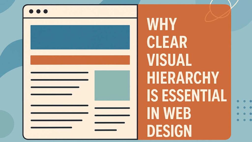
When someone lands on your website, you’ve got only a few seconds to capture their attention. In those first moments, people decide whether to stay or leave. A clear visual hierarchy guides their eyes, indicating where to start and highlighting what’s most important.
Without it, even the most creative design can fall flat, leaving users confused, overwhelmed, or clicking away. With it, your site feels effortless to use, trustworthy, and focused.
Why Visual Hierarchy Matters
Visual hierarchy is about organising design elements so the most important things stand out first. It works like a roadmap, ensuring visitors instinctively know where to go next.
For example, if your “Book a Consultation” button blends into the background, few people will find it. But when hierarchy is applied correctly, users are naturally drawn to it without having to think.
- Research by Nielsen Norman Group shows users don’t read web pages word-for-word — they scan. A strong hierarchy makes that scan meaningful and productive, boosting engagement and conversions.
How to Achieve a Strong Visual Hierarchy
Here are the principles professional designers rely on:
- Size and Scale – Bigger elements naturally get attention. Use this for headings, banners, and CTAs.
- Colour and Contrast – High contrast highlights key sections, while muted colours allow secondary items to fade into the background.
- Typography – Font size, weight, and style all establish importance. Headings should stand out clearly.
- Spacing and Layout – White space isn’t wasted space; it’s what gives content room to breathe.
- Visual Flow – Structure content so the eye moves in familiar reading patterns (Z-pattern or F-pattern).
What to Focus On
When designing, keep these in mind:
- Clarity beats cleverness – Users should instantly know what matters most.
- Mobile-first hierarchy – Smaller screens demand sharper decisions.
- Consistency across pages – Repeatable hierarchy builds trust and familiarity.
- Call-to-action prominence – Don’t bury CTAs in clutter. They should stand out every time.
If you want to see how we apply this in practice, check out our web design services, where hierarchy is built into every project to maximise engagement.
Common Pitfalls to Avoid
Cutting corners on hierarchy often backfires. The biggest mistakes include:
- Overloading the page – If everything screams “look at me!”, nothing stands out.
- Ignoring accessibility – Low contrast or chaotic layouts lock out users with visual impairments.
- Style over substance – Overusing animations or effects can distract from the actual message.
- Inconsistency – If hierarchy changes wildly between pages, visitors lose trust.
Real-World Example
A local retailer we worked with had a homepage packed with promotions, banners, and product carousels. Everything competed for attention — and users weren’t clicking through.
After redesigning with a clear hierarchy (fewer promotions, one bold CTA, and structured product blocks), their bounce rate dropped by 27% and conversions increased within a month.
The lesson? Hierarchy isn’t decoration — it drives real results.
Ready for a Website That Works as Hard as You Do?
Your website is often the first impression customers have of your business. At Digital Hype, we design and build responsive, conversion-focused websites for businesses across Bournemouth, Poole, Dorset and UK-wide. Let’s create a site that not only looks great but also drives real results.
Contact Our Web Design TeamBest Practice for Visual Hierarchy
- Keep every element intentional.
- Test layouts across desktop and mobile.
- Use analytics and heatmaps to check what users engage with most.
- Align hierarchy with your SEO structure — heading tags (H1, H2, H3) should reinforce both design and search performance.
Pairing design hierarchy with innovative SEO strategies ensures your website not only looks great, but also ranks well and works harder for your business.
Turning Hierarchy Into Results
A website with a clear hierarchy isn’t just about aesthetics; it directly affects user behaviour. When visitors know where to look first, they feel more confident, stay longer, and are more likely to take action.
Whether you’re a small business in Bournemouth, a growing SME in Poole, or a corporate brand with nationwide reach, hierarchy is the glue that holds your design together. It’s what transforms a collection of pages into a clear, intuitive experience.
Quick Best-Practice Checklist for Visual Hierarchy
| Focus Area | Best Practice | Mistakes to Avoid |
| Size & Scale | Larger elements for headings & CTAs | Making everything oversized |
| Colour & Contrast | Use contrast for key items | Overusing colours or low contrast |
| Typography | Clear heading structure, easy-to-read fonts | Overly decorative or inconsistent fonts |
| Spacing & Layout | White space separates sections | Crowding or cramming everything together |
| Visual Flow | Guide users in a Z or F pattern | Random, disjointed placement |
| CTA Placement | Keep CTAs bold and visible | Hiding them among clutter |
Ready to Improve Your Website?
At Digital Hype, we design websites that strike a balance between clarity, creativity, and conversion. If you want a site that doesn’t just look good but works, explore our web design services or see how our online marketing expertise can help your business thrive across Bournemouth, Poole, Dorset, and the wider UK.


